Цикл обработки (чистый CSS) (HTML код)
<input type="checkbox" id="theme-toggle"/>

<label for="theme-toggle" class="toggle-button">></label>

<div class="theme-background"></div>

<div class="container">

  <div class="shape left"></div>

  <div class="shape middle"></div>

  <div class="shape right"></div>

</div>
Цикл обработки (чистый CSS) (CSS код)
body, html {

  width: 100%;

  height: 100%;

  font-size: 12px;

  font-weight: bold;

  font-family: monospace;

  display: flex;

  flex-direction: column;

  align-items: center;

  justify-content: center;

}


.theme-background {

  background-image: linear-gradient(to right, #f5f5f5, #f5f5f5 50%, #333333 50%);

  background-size: 200%;

  z-index: -1;

  position: absolute;

  width: 100%;

  height: 100%;

  transition: all 0.8s;

}


.toggle-button {

  border-radius: 50%;

  width: 20px;

  height: 20px;

  text-align: center;

  line-height: 20px;

  background-color: #333333;

  color: #f5f5f5;

  transition: all 0.8s;

  backface-visibility: hidden;

}


input {

  visibility: hidden;

}

input:checked ~ .theme-background {

  background-position: 100%;

}

input:checked ~ .toggle-button {

  color: #333333;

  transform: rotate(180deg);

  background-color: #f5f5f5;

}


.container {

  display: flex;

  align-items: center;

  justify-content: center;

  margin-top: 15px;

  mix-blend-mode: difference;

}


.shape {

  width: 2px;

  height: 175px;

  box-shadow: inset 0 0 0 2px #f5f5f5;

  margin: 10px;

  animation: change 4.5s infinite;

}


.middle {

  animation-delay: 1.5s;

}


.right {

  animation-delay: 3s;

}


@keyframes change {

  0%, 66.6% {

    width: 2px;

  }

  33.3% {

    width: 100px;

  }

}
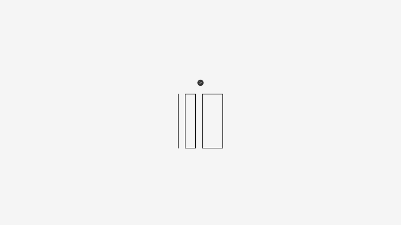
Цикл обработки (чистый CSS) (Результат кода)
Comments