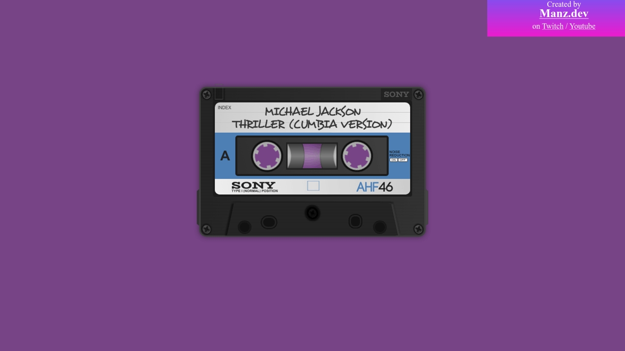
Кассета на чистом CSS (HTML код)
<div class="container">

    <div class="cassette">

      <div class="top-tape">

        <div class="arrow-mark-container">

          <div class="arrow-mark">🡁</div>

        </div>

        <div class="brand-mark">SONY</div>

      </div>

      <div class="medium-tape">

        <div class="label-container">

          <div class="label">

            <div class="top-label">

              <div class="predefined-text">INDEX</div>

              <div class="top-text">

                <div>MICHAEL JACKSON</div>

                <div>THRILLER (CUMBIA VERSION)</div>

              </div>

            </div>

            <div class="medium-label">

              <div class="side-name">A</div>

              <div class="gap-container">

                <div class="gap">

                  <div class="left tapereel">

                    <div class="notch notch-1"></div>

                    <div class="notch notch-2"></div>

                    <div class="notch notch-3"></div>

                  </div>

                  <div class="central-gap">

                    <div class="left innertape"></div>

                    <div class="right innertape"></div>

                  </div>

                  <div class="right tapereel">

                    <div class="notch notch-1"></div>

                    <div class="notch notch-2"></div>

                    <div class="notch notch-3"></div>

                  </div>

                </div>

              </div>

              <div class="noise-reduction">

                NOISE REDUCTION

                <div class="box">

                  <div>ON</div>

                  <div>OFF</div>

                </div>

              </div>

            </div>

            <div class="bottom-label">

              <div class="brand-text">

                <div class="maintext">SONY</div>

                <div class="subtext">TYPE I (NORMAL) POSITION</div>

              </div>

              <div class="arrow-text"><span>🡆</span></div>

              <div class="model-text"><span>AHF</span>46</div>

            </div>

          </div>

        </div>

      </div>

      <div class="bottom-tape">

        <div class="magnetic-shield-container">

          <div class="magnetic-shield">

            <div class="left-hole-container">

              <div class="hole hole-1"></div>

              <div class="hole hole-2"></div>

            </div>

            <div class="screw-container">

              <div class="screw"></div>

            </div>

            <div class="right-hole-container">

              <div class="hole hole-3"></div>

              <div class="hole hole-4"></div>

            </div>

          </div>

        </div>

      </div>

      <div class="screw screw-1">

        <div class="dot"></div>

      </div>

      <div class="screw screw-2">

        <div class="dot"></div>

      </div>

      <div class="screw screw-3">

        <div class="dot"></div>

      </div>

      <div class="screw screw-4">

        <div class="dot"></div>

      </div>

    </div>

  </div>


<div class="created">

  <span>Created by</span>

  <a href="https://manz.dev/"><h2>Manz.dev</h2></a>

  <p>on <a href="https://twitch.tv/ManzDev">Twitch</a> / <a href="https://www.youtube.com/c/ManzDev/videos">Youtube</a></p>

</div>
Кассета на чистом CSS (CSS код)
@font-face {

  font-family: "BioRhyme";

  src: url(https://manzdev.github.io/twitch-cassette/assets/biorhyme.woff) format("woff");

}


@font-face {

  font-family: "Code";

  src: url(https://manzdev.github.io/twitch-cassette/assets/code.woff2) format("woff");

}


@font-face {

  font-family: "Desyrel";

  src:

    url(https://manzdev.github.io/twitch-cassette/assets/desyrel.woff) format("woff"),

    url(https://manzdev.github.io/twitch-cassette/assets/desyrel.woff2) format("woff2");

}


:root {

  --body-bgcolor: #774486;

}


.container {

  display: flex;

  justify-content: center;

  align-items: center;

  height: 90vh;

}


body {

  background: var(--body-bgcolor);

}


.cassette {

  --width: 458px;

  --bgcolor: #2f2f2f;

  --border-color: #404040;

  --light-color: #555;

  --dark-color: #1c1c1c;

  --external-notch-shape: polygon(100% 0, 0 5%, 0 95%, 100% 100%);


  width: var(--width);

  background: var(--bgcolor);

  background-image:

    linear-gradient(273deg, #fff1, transparent),

    repeating-linear-gradient(to bottom, #1c1c1c 3px, #2c2c2c 6px);

  border: 3px solid var(--border-color);

  border-radius: 15px;

  display: flex;

  flex-direction: column;

  position: relative;

  box-shadow: 0 0 10px 2px #2227;

}


.cassette::before,

  .cassette::after {

    content: "";

    display: block;

    background: #333;

    width: 5px;

    height: 75px;

    position: absolute;

    bottom: 20px;

    -webkit-clip-path: var(--external-notch-shape);

            clip-path: var(--external-notch-shape);

  }


.cassette::before {

    left: -8px;

  }


.cassette::after {

    right: -8px;

    transform: scaleX(-1);

    background: #444;

  }


.cassette .top-tape {

    display: flex;

    justify-content: space-between;

    height: 25px;

    padding: 0 25px;

  }


.cassette .top-tape .arrow-mark-container {

      background: #0004;

      display: flex;

    }


.cassette .top-tape .arrow-mark-container .arrow-mark {

        color: var(--light-color);

        font-size: 32px;

        transform: scaleY(1.6) translate(0, -10px);

      }


.cassette .top-tape .brand-mark {

      background: #0004;

      font-family: "BioRhyme", serif;

      padding: 0 6px;

      color: var(--light-color);

    }


.cassette .medium-tape {

    display: flex;

    justify-content: center;

  }


.cassette .medium-tape .label-container {

      width: 400px;

      background: var(--dark-color);

      border-radius: 4px;

      padding: 4px;

    }


.cassette .medium-tape .label-container .label {

        background: #eee;

        background-image:

          repeating-linear-gradient(transparent 0 20px, #c6c6c6 20px 21px),

          linear-gradient(278deg, #eee, #ccc);

        border-radius: 10px;

      }


.cassette .medium-tape .label-container .label .top-label {

          height: 62px;

          font-weight: normal;

          font-size: 16px;

          color: #333;

        }


.cassette .medium-tape .label-container .label .top-label .predefined-text {

            font-family: Arial;

            font-size: 9px;

            padding: 6px 6px 4px;

            position: absolute;

          }


.cassette .medium-tape .label-container .label .top-label .top-text {

            font-family: "Desyrel", sans-serif;

            padding: 6px 10px;

            font-size: 24px;

            line-height: 110%;

            text-shadow: 0 0 1px #444;

            text-align: center;

          }


.cassette .medium-tape .label-container .label .medium-label {

          height: 95px;

          background: #4d7fb4;

          display: flex;

          justify-content: center;

          align-items: center;

          font-family: Arial, sans-serif;

        }


.cassette .medium-tape .label-container .label .medium-label .side-name {

            width: 50px;

            font-weight: bold;

            font-size: 28px;

            display: flex;

            justify-content: center;

            align-items: center;

            color: #222;

          }


.cassette .medium-tape .label-container .label .medium-label .gap-container {

            width: 360px;

            height: 75px;

            border: 4px solid var(--dark-color);

            background: var(--bgcolor);

            background-image: linear-gradient(76deg, transparent, #aaa2);

            border-radius: 5px;

          }


.cassette .medium-tape .label-container .label .medium-label .gap-container .gap {

              height: 100%;

              display: flex;

              justify-content: center;

              align-items: center;

            }


.cassette .medium-tape .label-container .label .medium-label .gap-container .gap .tapereel {

                width: 50px;

                height: 50px;

                display: flex;

                justify-content: center;

                align-items: center;

                border-radius: 50%;

                border: 4px solid #aaa;

                box-shadow: 0 0 0 4px #111;

                background: var(--body-bgcolor);

              }


.cassette .medium-tape .label-container .label .medium-label .gap-container .gap .tapereel.left {

                  animation: spin 6s linear infinite reverse;

                }


.cassette .medium-tape .label-container .label .medium-label .gap-container .gap .tapereel.right {

                  animation: spin 8s linear infinite reverse;

                }


.cassette .medium-tape .label-container .label .medium-label .gap-container .gap .tapereel .notch {

                  background: linear-gradient(to right, #aaa 0 10%, transparent 12% 88%, #aaa 90% 100%);

                  width: 50px;

                  height: 8px;

                  position: absolute;

                }


.cassette .medium-tape .label-container .label .medium-label .gap-container .gap .tapereel .notch-1 { transform: rotate(60deg); }


.cassette .medium-tape .label-container .label .medium-label .gap-container .gap .tapereel .notch-2 { transform: rotate(0deg); }


.cassette .medium-tape .label-container .label .medium-label .gap-container .gap .tapereel .notch-3 { transform: rotate(-60deg); }


.cassette .medium-tape .label-container .label .medium-label .gap-container .gap .central-gap {

                width: 100px;

                height: 50px;

                border: 3px solid #222;

                background: var(--body-bgcolor);

                margin: 0 10px;

                overflow: hidden;

                position: relative;

              }


.cassette .medium-tape .label-container .label .medium-label .gap-container .gap .central-gap::after {

                  content: "";

                  display: block;

                  width: 100%;

                  height: 100%;

                  background-image: linear-gradient(transparent, #fff5, transparent);

                  position: absolute;

                  top: 0;

                }


.cassette .medium-tape .label-container .label .medium-label .gap-container .gap .central-gap .innertape {

                  width: 150px;

                  height: 150px;

                  border-radius: 50%;

                  background: radial-gradient(#999 45%, #3e3e3e 47% 100%);

                  border: 2px solid #2e2e2e;

                  position: relative;

                }


.cassette .medium-tape .label-container .label .medium-label .gap-container .gap .central-gap .innertape.left {

                    transform: translate(-119px, -52px);

                  }


.cassette .medium-tape .label-container .label .medium-label .gap-container .gap .central-gap .innertape.right {

                    transform: translate(66px, -206px);

                    box-shadow: -10px -10px 15px #3335;

                  }


.cassette .medium-tape .label-container .label .medium-label .noise-reduction {

            width: 50px;

            font-size: 7px;

            display: flex;

            flex-direction: column;

            justify-content: center;

            margin-left: 2px;

          }


.cassette .medium-tape .label-container .label .medium-label .noise-reduction .box {

              display: flex;

              margin-top: 2px;

            }


.cassette .medium-tape .label-container .label .medium-label .noise-reduction .box > div {

                border: 1px solid #444;

                background: #fff;

                font-size: 6px;

                padding: 0 3px;

                border-radius: 2px;

              }


.cassette .medium-tape .label-container .label .bottom-label {

          border-bottom-left-radius: 10px;

          border-bottom-right-radius: 10px;

          background: #eee;

          background-image: linear-gradient(-278deg, #eee, #ccc);

          height: 32px;

          display: flex;

          justify-content: space-around;

          align-items: center;

        }


.cassette .medium-tape .label-container .label .bottom-label .brand-text .maintext {

              font-family: "BioRhyme", sans-serif;

              font-size: 20px;

              color: #222;

              transform: translate(18px, 0) scaleX(1.4);

            }


.cassette .medium-tape .label-container .label .bottom-label .brand-text .subtext {

              font-family: Arial, sans-serif;

              font-weight: bold;

              color: #333;

              font-size: 7px;

              transform: translateY(-7px);

            }


.cassette .medium-tape .label-container .label .bottom-label .arrow-text {

            color: #4d7fb4;

            font-size: 32px;

            transform: scaleX(1.5) translate(-6px, -3px);

          }


.cassette .medium-tape .label-container .label .bottom-label .model-text {

            font-family: "Code", sans-serif;

            font-weight: bold;

            color: #222;

            font-size: 28px;

            transform: translate(0, 2px);

          }


.cassette .medium-tape .label-container .label .bottom-label .model-text span {

              color: #4d7fb4;

            }


.cassette .bottom-tape {

    height: 80px;

    display: flex;

    justify-content: center;

    align-items: flex-end;

  }


.cassette .bottom-tape .magnetic-shield-container {

      filter:

        drop-shadow(-4px 0 1px #131313)

        drop-shadow(4px 0 1px #383838)

        drop-shadow(0 -4px 0 #202020);

    }


.cassette .bottom-tape .magnetic-shield-container .magnetic-shield {

        background: #2a2a2a;

        width: 350px;

        height: 65px;

        -webkit-clip-path: polygon(0 100%, 4% 0, 96% 0, 100% 100%);

                clip-path: polygon(0 100%, 4% 0, 96% 0, 100% 100%);

        display: flex;

        justify-content: space-between;

        background-image: repeating-linear-gradient(to bottom, #2c2c2c 3px, #1c1c1c 6px);

      }


.cassette .bottom-tape .magnetic-shield-container .magnetic-shield .left-hole-container,

        .cassette .bottom-tape .magnetic-shield-container .magnetic-shield .right-hole-container {

          width: 125px;

          display: flex;

          justify-content: space-evenly;

          align-items: flex-end;

        }


.cassette .bottom-tape .magnetic-shield-container .magnetic-shield .hole.hole-2,

        .cassette .bottom-tape .magnetic-shield-container .magnetic-shield .hole.hole-3 {

          transform: translateY(-15px);

          border: 3px solid #222;

          width: 24px;

          height: 18px;

          border-radius: 30px;

          box-shadow: 0 0 0 2px #111;

        }


.cassette .bottom-tape .magnetic-shield-container .magnetic-shield .hole.hole-3 {

          width: 20px;

          border-radius: 10px;

          transform-origin: 50% 50%;

          transform: rotate(90deg) translateX(-17px);

        }


.cassette .bottom-tape .magnetic-shield-container .magnetic-shield .screw-container::before {

            content: "";

            display: block;

            background: rgba(0, 0, 0, 0.75);

            width: 20px;

            height: 20px;

            border-radius: 50%;

            position: relative;

            top: 10px;

            z-index: 10;

          }


.cassette .bottom-tape .magnetic-shield-container .magnetic-shield .screw-container .screw {

            position: absolute;

            left: calc(50% - 8px);

            top: 10px;

            box-shadow:

              0 0 2px 4px #000,

              0 0 2px 8px #111;

          }


.cassette .bottom-tape .magnetic-shield-container .magnetic-shield .hole {

          width: 20px;

          height: 20px;

          border-radius: 50%;

          background: #111;

          border: 2px solid #191919;

          box-shadow: 0 0 0 2px #171717;

          transform: translateY(-5px);

        }


.cassette .screw {

    background: linear-gradient(#555, #333);

    width: 16px;

    height: 16px;

    border-radius: 50%;

    position: absolute;

    display: flex;

    justify-content: center;

    align-items: center;

    border-top: 1px solid #222;

    border-bottom: 1px solid #666;

    transform: rotate(-25deg);

    box-shadow: 0 0 2px 2px #111;

  }


.cassette .screw .dot {

      width: 4px;

      height: 4px;

      background: #222;

      border-radius: 50%;

      position: absolute;

      z-index: 5;

      filter: blur(1px);

    }


.cassette .screw::before,

    .cassette .screw::after {

      content: " ";

      display: block;

      background: linear-gradient(to right, #222 10%, #111 45% 65%, #222 90%);

      width: 14px;

      height: 4px;

      border-radius: 2px;

      position: absolute;

    }


.cassette .screw::before {

      transform: rotate(45deg);

    }


.cassette .screw::after {

      transform: rotate(-45deg);

    }


.cassette .screw.screw-1 {

      top: 4px;

      left: 4px;

    }


.cassette .screw.screw-2 {

      top: 4px;

      right: 4px;

    }


.cassette .screw.screw-3 {

      bottom: 4px;

      left: 4px;

    }


.cassette .screw.screw-4 {

      bottom: 4px;

      right: 4px;

    }


@-webkit-keyframes spin {

  0% {

    transform: rotate(0deg);

  }


  100% {

    transform: rotate(360deg);

  }

}


@keyframes spin {

  0% {

    transform: rotate(0deg);

  }


  100% {

    transform: rotate(360deg);

  }

}


.created {

  background:

    url(https://assets.codepen.io/154065/internal/avatars/users/default.png),

    linear-gradient(to bottom, #884ced, #ec1cce);

  background-size: 75px 75px, cover;

  background-repeat: no-repeat;

  position: absolute;

  top: 0;

  right: 0;

  width: 250px;

  height: 75px;

  display: flex;

  flex-direction: column;

  align-items: center;

  padding-left: 2em;

}


.created span,

  .created h2,

  .created p,

  .created a {

    font-family: Montserrat;

    margin: 0;

  }


.created a,

  .created p,

  .created span {

    color: #fff;

  }


.created h2 {

    font-weight: 700;

    transform: translate(0, -4px);

  }


.created a {

    -webkit-text-decoration-color: rgba(255,255,255,0.4);

            text-decoration-color: rgba(255,255,255,0.4);

  }


.created a:hover {

    color: #e6e82a;

  }
Кассета на чистом CSS (JS код)
/* Look mom, without JS */

//# sourceURL=pen.js
Кассета на чистом CSS (Результат кода)
Comments